Login
iFlicks on Twitter
| New John Carter Stills Show Double Negative Have Still Got It |

|

|
| Written by Ivan Radford |
| Tuesday, 29 November 2011 08:24 |
|
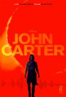
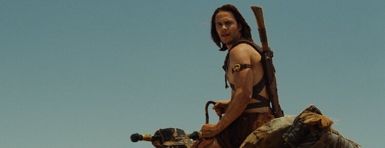
Some new John Carter stills have been doing the rounds this week, along with a new poster. And while a lot of people are rightly praising Andrew Stanton (Mr. WALL-E) for his jump from the animated director's post to the live action helm, CGI geniuses Pixar aren't the people doing the effects. That would be a lovely London company called Double Negative. I first heard of Double Negative back when Let Me In director Matt Reeves was doing the rounds for Cloverfield. I can't find my notes from then in my filing cabinet (read: drawer full of crap), but here's what Reeves said to Den of Geek: "Double Negative are amazing. They did the Bourne movies, they did United 93 - in fact I saw the crash in United 93 and I said 'That crash is just burned into my memory, and when we have a similar sequence I want to pull on that for inspiration,' it was so convincing. They also did the latest Batman films..." Being mightily impressed by Cloverfield, I moseyed on over to Double Negative's website. After Reeves' handheld monster madness, you might expect to see them on credits such as Green Zone, but they've also worked on everything from Harry Potter and the Deathly Hallows and Scott Pilgrim vs. the World to Inception and Attack the Block. Plus they were responsible for getting the boat to sink in The Boat that Rocked (the only good part of the film). Go back to 1998 and they even worked on Pitch Black. Now that's an awesome start to a CV. In short, Double Negative? Yeah, they're the dogs bollocks. And they could probably even create a convincing pair for you if you wanted. Reeves added: "What impressed me so much with them, I think if you see the film there are many scenes you’ll look at and you'll say, "Okay, well, that was an effect and that was an effect..." and it’ll be obvious because it’ll seem like something you wouldn’t be able to see in reality. But the stuff that blew me away was the stuff that was invisible. There are so many shots in the movie that you would never think are visual effects, and that’s a testament to how good their work is." And there you have it. Right bang on the nose. That's what effects should be - and these are the kind of guys who can seamlessly blend into the background on a small project like Gerald McMorrow's Franklyn, where they made a convincing dystopian backdrop through some subtle (and gorgeous) matte paintings. Give them a bigger budget and an ambitious canvas, and they're still doing top-notch stuff, but judging by the trailer and clips shown at Empire's BigScreen earlier this year, that ability to be unnoticed doesn't seem to have gone anywhere. There's a full trailer for John Carter being released on Thursday. Here's hoping the effects continue to look suitably epic - and subtle. Until then, read on to see the full gallery of John Carter images, plus the new poster (stolen from First Showing) that's so full of red, it could have been painted by Tilda Swinton in We Need to Talk About Kevin. Or head this way to watch the John Carter teaser trailer. But most importantly, remember to give Double Negative a wave next time you're on Shaftesbury Avenue.


Tags:
|
|


